Thursday, November 19, 2009

Art Journal

 I thought I would post some scans from my visual journal. Although its not technically graphic design, I use a lot of the same ideas for art as for my design work - like composition, colour, texture, tone etc. I really like playing with colour and texture in my collages and painting, and I work fairly intuitively, just throwing things down and seeing if they work.  


Sunday, November 15, 2009

Final CD Cover Design

I've completed my final assignment in Graphic Design, the retro CD cover design project. I ended up choosing this design as my final cover, because I liked the play on the title of the album and the visual aesthetics of the piece. I think out of my thumbnails and solutions this one has the most relevance to the album, band and era, while remaining an interesting design. 
{front cover}

The process I followed in creating this design was to start with a photo I took while on holiday in Victoria, add a picture of an eyeball I found online and blend it into the background using layer masks in Photoshop, and add the text in interesting fonts. I used the font 'Orator' for a retro feel, and 'Chopin Script' to contrast with the other font and add some visual interest. Overall I'm quite happy with this design.

{back cover}

I designed the back cover similarly to the front cover of this design, adding an image of the band to the base photo and then adding the band members names and the song titles to the design, using a simple font. I had to play around with colours a lot in this design, because when I printed the design the colours were very different to how it looked on the computer. I changed the text of the song titles from white to brown so they would stand out against the background, and altered the tones of the photo of the band to make it more brown so it would fit with the rest of the design.

This was a fun assignment and I enjoyed designing this CD cover and working with influences from retro design.

Wednesday, November 11, 2009

CD Cover Thumbnails

For the term 4 assignment, retro design, I've completed my nine thumbnail designs and am now working on my solutions and final artwork. I tried to experiment with a variety of ideas in my designs, drawing inspiration from design from the 70's and 80's, but giving them a modern twist.

Thursday, October 29, 2009

CD Cover Design

The new assignment in Graphic Design involves designing an album cover for the post punk 80's band Joy Division. As well as research on the design from this era, I've also been looking at more general and modern examples of CD cover design. I found an interesting website about album cover design, sleevage.com, which I found really helpful to find examples of good CD cover design. There are some very interesting ideas on this website, showcasing the skill of artists and designers who design album covers. Here are some of the cover designs that stood out to me, some of which I might use as inspiration to base my thumbnail designs on.

Sunday, October 11, 2009

Sydney Design Inspiration

Over the school holidays I went to Sydney for a weekend for my birthday, to do some shopping and sightseeing, and found some interesting examples of good design which caught my eye.

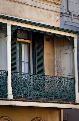
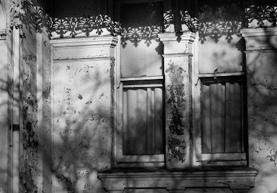
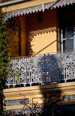
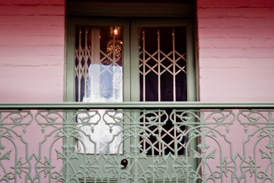
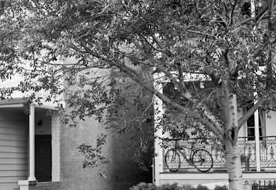
I loved Paddington and especially all the old terraces that line the back streets. I love the history of them, and their layers of texture and colour. I think they were designed in a time when a lot of pride was put into design and architecture, unlike the ugly apartments which are often built now. I thought these terraces were an example of good design and using design to create a beautiful space that I would love to live in.


I also went to the markets at Paddington and Bondi. I didn't take any photos there but i loved looking through the handmade clothes, jewelry, and art. I like the idea of knowing someone made an item by hand, rather than being mass produced by a machine or in a sweatshop. There was a huge variety of examples of good design, in the fashion and jewelry, craft, art and other items which had been produced using good design principles.

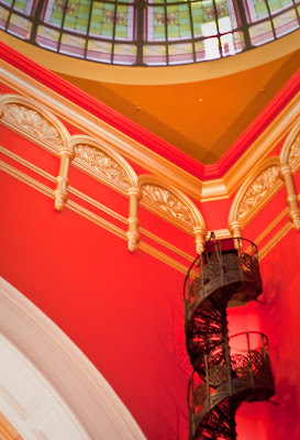
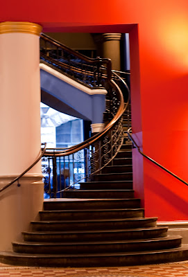
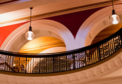
The other place I visited where I noticed the design was the Queen Victoria Building in the city. The architecture is amazing, and has obviously been carefully designed according to the design principles. There are so many little details which must have been painstakingly designed and produced. Again, I think this building was built in a time when pride was put into the design and construction of buildings.


I also visited a huge bookstore, Kinokuniya, where there was a great section on graphic design. I didn't end up buying any design books, but I enjoyed looking through some books and gaining ideas for my own designs.

I really enjoyed visiting Sydney, and I hope I can go back soon. I loved the sense of history and the great design that is evident in the atmosphere of the city.

Thursday, September 17, 2009

Final Rebel Poster and Website

I have completed my poster and website for the "Rebel" graphic design assignment. I created a number of thumbnails and then chose three solutions to continue working on. From those three I decided that this poster was the most effective design which was visually interesting but remained informative and relevant to the issue.

I made this poster in Photoshop, using a variety of fonts and an interesting image to convey my message. The process I followed included finding an interesting image online which represented the issue of sweatshops and outworkers and making it slightly transparent so it wouldn't detract from the rest of the poster. I then developed a catchy slogan and placed it across the picture in a large, bold font, to catch the attention of the viewer. After using different fonts to add more information at the bottom of the frame, I added accents in yellow to match the $2 coins. i hope this poster is visually interesting while conveying a message about sweatshops and encouraging the viewer to make a difference.


I used a similar process for this design. I used many of the same elements of the poster, but converted them to a format that would work better for a web page. I converted the image to a horizontal format and added the text that I used for the poster. I then added a block of text (on a yellow background to fit with the rest of the design) containing more information about the issue and how the viewer could help.
The idea of this design is for it to be a guerilla web site splash page which pops up when accessing certain governmental sites. I wanted this web page to shock the viewer and prompt them to find out more and petition the government to stop the exploitation of sweatshop workers and outworkers.

Thursday, August 27, 2009

Long Exposure Photography

I recently had an assignment in my Photography class that involved using long exposure photography and painting with light to produce five final images relating to a theme. I chose the theme of "transformation" to base my photos on.
This photo is meant to represent a cocoon, which relates to my theme. I took this photo by using a long exposure and getting someone to spin a hula hoop covered in fairy lights to create the streaks of light. Originally the light was round, but I altered it in Photoshop to fit with my theme.


I used the same technique for this image as for the previous one. I'm really happy with how this one turned out, as I think its visually interesting and relates to my theme. I wanted the figure to appear as though it was "walking towards the light", therefore representing the transformation from life to death or the afterlife.


My aim in taking this photo was to make an image representing the hope and possibility of redemption and transformation. The butterfly is meant to represent transformation, and the figure someone who has lost hope. I wanted to make an interesting image with a deeper meaning about never giving up hope for a transformation.

My idea behind this image was to make a photo representing the transformation from life to death by using the image of a ghost leaving the body. I like the ethereal quality of this photo, and the story told by the image.

This is another photograph using a hula hoop and fairy lights. I used my brother as a model and raised the hula hoop over his head to create the streaks of light surrounding him. The photo was meant to represent the process of transformation.

I'm really happy with how these photos turned out, and I had a lot of fun experimenting with light and photography.